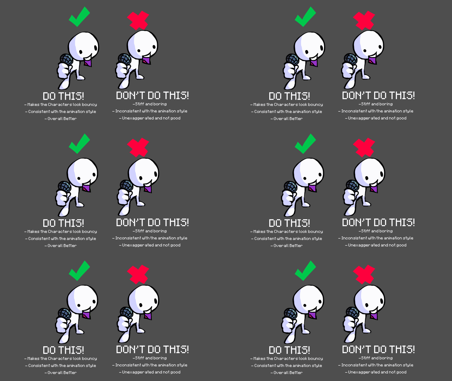
SNAPBACK IS IMPORTANT AND MAKES SPRITES LOOK BETTER!!!!!!
I will explain.

As you can see, the left animation (The one with the snapping frames) looks better than the right. Why? Based off the text describing them, the left looks more bouncy and life-like than the right since the exaggeration on the first frame makes the character “pop-out” and have emotion while the right eases in on one frame and the next shows the exaggeration, and doesn’t make it look “poppy” as the left. The exaggeration is called a snapping frame and the technique the left is using is called “SnapBack”. This is the main technique used in FNF’s animation to make the characters look “poppy” and fluid in the main sprite animations and even some of the cutscenes. The error on the right side is that the ease in frame is being used as the snapping frame while the snapping frame is used as the ease-in, which is fine for some mods (Funkhead for example) if they change the overall animation style, but I’m not talking about those mods, we’re talking about the vanilla game. This not only is inconsistent with the game, but it gives the animation slight delay in their animation when the player presses on the arrows. This is actually a very common error for fnf animators, especially popular mods like Sonic.Exe’s lord x sprites.

Overall, Keep this technique in mind for animating sprites for fnf‘s style since it can help the animation look good and keep it consistent with the game’s animation style.


